It’s true that pictures speak a thousand words, but sometimes in order to make such images more compelling, you have to take necessary majors, and this is where typography comes to play its part.
Typography is a key element to add authenticity and centricity to the content and gives an entirely new and fresh feel to a website. However, not everyone is proficient in making a right use of this incredible component. And therefore, we made sure to highlight some absolutely proven and striking typography principles to make your website’s text readable and completely visitors focused.
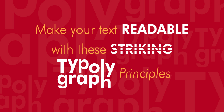
Let’s dive in.
- Start with a Smart Visual Hierarchy
Before digging in deeper, let’s talk about what visual hierarchy really is.
It’s a process that guides your reader by highlighting the parts of your content that you want him to focus. As a matter of fact, when we create website, there are so many things for a visitor to read, but plotting an effective visual hierarchy will help you drive results by defining your intent and making the process extremely clear and convincing.
- Look Out for Enthralling Color Contrast
Using a right color contrast is what doubles the charm of your text and make it captivating to an eye. Now, this particular aspect requires you to be a great observant because knowing the preferences of your audiences will guide you to be accurate and results-driven with the combination of colors.
- Imply White Space for Centricity
If you’re not sure even after finalizing an appropriate color contrast, then we recommend you to imply white space to your design to overcome all your misconceptions.
Believe it or not, but this single move will bring your text to the spotlight and make it simplistically relevant for your readers.
- Be Creative and to-the-point with Your Text
Last of all, you have to be extremely creative when producing the content of your website. Remember, people don’t want to see a long and pathetic piece of text that keeps on going. Rather, they are more willing to grasp the information they want in the quickest way possible.
For this, be very critical with your content style, so that you can keep the things flowing to your way.