When talking about responsive web design and the practices related to it, Logo is one part of the design that often gets overlooked. In most of the responsive galleries, logo gets shrunk in the space that is available, instead of finding a solution that finds properly reducing its size and finding relevant space for it.
This approach of simply reducing the size of the logo can work for minimal and simple logos, but doesn’t work in detailed logos. Also, when reduced the size of it, the type in the logo becomes unreadable and the logo itself can become unrecognizable.
Having logos that aren’t designed to adapt to various environments can harm your business, giving your customers the idea about your lack of seriousness. Everyone in online marketing and design business knows that the logo projects a company’s image to the public.
If it gets distorted on mobile phones and tablets, you won’t be making a good case for yourself in the front of the potential customer visiting your website. Following are some tips and tricks to create logo designs that are responsive and scalable.
1. Logo Style Guides
Many companies provide branding and logo style guide to the designers working with them. They have different variations available for their logos after researching well into how to make the logos more readable in different environments and sizes and implement the variations according to their findings.
For example, you can use an alternative logo for Penn State University if you want to display it on relatively smaller screens. The logo for small screen has the type removed from it and the size expanded horizontally to make it more readable.
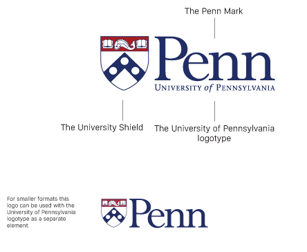 Image Courtesy of: https://viget.com/uploads/image/blog/upenn-logo-style-guide.png
The result is a more readable logo, as shown in the picture below:
 Image Courtesy of: https://viget.com/uploads/image/blog/upenn-comparison.png
As you can see, the original logo (above) has text clattered together and type is not readable. The one below is much easier to read.0
2. Reducing Details
Logos with complicated details are not as common, nowadays. Still, if you are working on one and want to make it more responsive and readable in smaller screens, simply remove the intricate details to make it simpler.
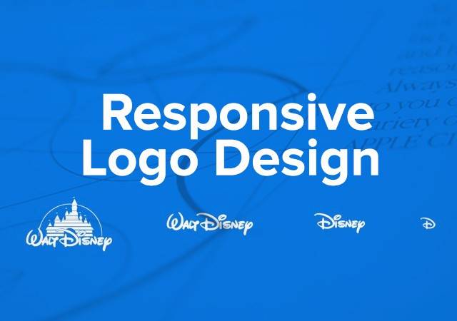 Image Courtesy of: http://gabbibada.tumblr.com/post/133927593809/responsive-logo-design-tips-tutorial
As you can see in the Walt Disney logo above, simpler designs (on the right side) will go better on smaller screens than the complicated one (on the left).
3. Subtracting Elements of Logo Incrementally
If you have to use the logo on dives of three different sizes, you can remove certain elements of the logo incrementally.
For relatively smaller screens (like that of a tablet), the text surrounding the main body of logo can be removed. For even smaller ones, the text inside the emblem of the logo can be eliminated. Company’s brand recognition is still intact in all version of the logo.