We talk a lot about design, its impacts on human behavior and conversion rates. Because in today’s customer-centric era, a satiating design is one of the significant elements that delight a prospect, and if it is blending in with the quality content, produces phenomenal results.
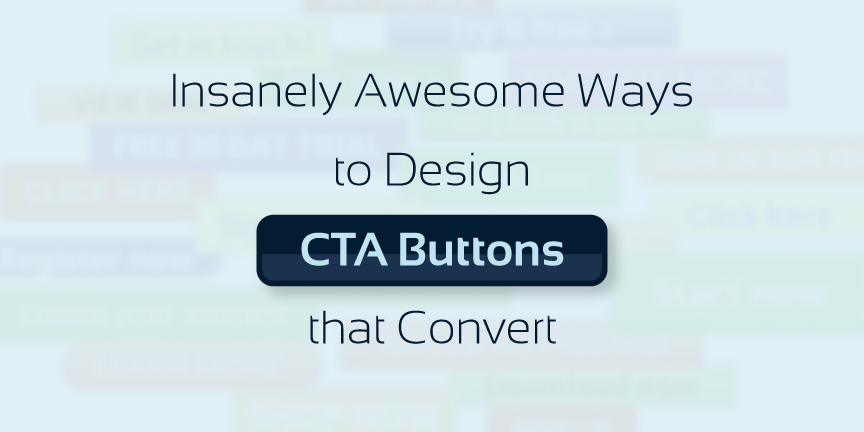
So, here we are going to talk about an integral part of a reader focused design, CTA (Call-to-Action).
CTA is a small button that does its magic if used in an appropriate way. But, do you know what these ways really are? Do you know how you can make an amazing use of your CTAs, so that they can drive incredible sales?
Well, this blog has the answer to all such questions.
- Your Button Should be Highly Visible
If you curiously want your visitors to take action, make your call-to-actions visible.
A CTA should clearly standout from rest of the landing page’s content, as only this way you can compel your prospects to take actions and complete their buying journey in a positive way.
- Make it in First Person
When it comes to copywriting or even blogs, the first priority of a writer is to make his write-ups as much astonishing and informative as possible. And to achieve that level, he prefers writing in second person.
Honestly, this is the only approach that makes a reader interesting. But, when you are producing phrases for your CTAs, you have to be slightly different. Here, writing in first person will be impactful.
You have to be strong psychologically, when deciding on the colors of your CTAs.
But remember, if one color is working incredibly fine on your competitor’s website might not work on yours. Therefore, you should keep the page’s layout, its ultimate purpose and your prospects in mind. This way, you will certainly end up with a much better and results-driven CTA to accomplish your goals.
- Stick with the Standard Shapes
Sometimes, it’s better to stay within the boundaries, and not try anything outside the box.
Similar is the case with CTA shapes. And, there are two shapes that you should consider all the time.
- Circle
- Rectangles
Instead of going over the top, we recommend you to adopt these two shapes to keep your text prominent and clearly visible to your desired audiences.