What’s the first think comes to mind when we hear Google? Or, when we talk about iPhone? Or, when we eat a Big Mac? It is their Logo!
Logo is the identity, the personality of your brand. When people talks about their favorite brand, they have a clear picture in mind of its insignia.
So, while etching your brand’s value and personality into your logo, research shows that you should also consider picking out the right color for it. It is because our mind is genetically, highly sensitive to different visual stimuli.
Neuroscientist Bevil Conway says in an interview to Co.design, “Knowing that humans might … be hardwired for certain hues could be a gateway into understanding the neural properties of emotion.”
That is the reason why understanding the psychology behind colors is indispensible to creating emotionally-engaging design, especially logo designs. After all, branding starts with having a logo (face) of a company!
Colors Tend to Influence the Efficacy of a Logo
Not only different colors tend to influence different moods, they also echo different meanings. Graphic designers can use the limitless power of colors to bring the best potential out of the logos. In other words, they can emphasize the core message of their brand more efficiently.
From fully vibrant to muted tones, you can touch different emotions of the observer. By and large, radiant colors signify vigor, dynamism and boldness, while muted colors suggest chic, elegance or urbanity.
By having a clear understanding of the color, designers can select colors for different aspects of a logo to make it more synchronized with the brand.
Different Colors, Different Moods
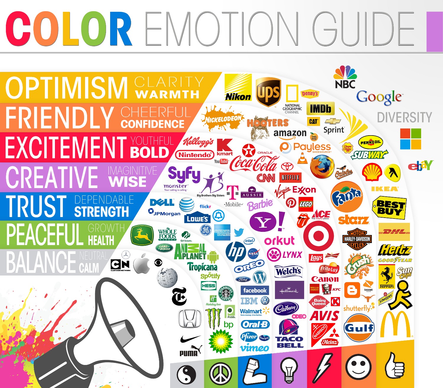
Image Courtesy of: Branding Magazine.com
Blue: Since blue reflect tranquility, trust, integrity, durability and security, you’d mostly see this color used by corporate. Since the color is associated closely with confidence and power, it is mostly worn by government entities and large organization. Best examples are IBM, Ford, Barclays, etc.
Yellow: It suggests warmth, friendly-environment, liberalism and optimism. In marketing areas, it denotes youthfulness. It can also be used to stimulate appetite. Brands using it are National Geographics, Shell, etc.
Red: Just the word RED is enough to kindle our appetite and make our bellies growl for food. The color also exudes energy, passion, action, and also aggression. Brands like Pizza Hut, McDonald, and etc., use it.
Black: Perhaps the most sophisticated of all colors, black is the symbol of elegance and style. However, if used in a gloomy setting, it can also reflect despair and misery. It is used by famous brands like Sony, Playboy, etc.
Orange: Another color that ignites the vigor in us and the best example of the brand using it is Fanta.
Multicolor: Though not use widely, but when multicolors are used they signify the youthfulness of the brand, its positivity, boldness and playfulness. Qous Qazah is also a great example using multicolor logo.