When it comes designing, one of the basics is consistency. If you are creating a digital product, like a PaaS or an OS, there is a need to ensure consistency in design throughout the system. For example, the color of CTA, typography styles, shapes and other visual elements must be in a perfect harmony throughout the system.
To ensure this consistency, the companies come up with their own design language or design guideline. A design language guides a designer in creating a design that is consistent in look and feel by using same colors, shapes, textures, patterns, etc.
A design language is especially necessary when a company has a range of complementary products. By following the design language in all their products, they can deliver consistent user experience in all their products.
Here are some of the popular design languages that you might be familiar with.
Material Design by Google
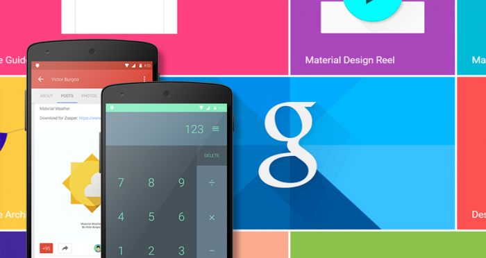
Material Design is perhaps the most popular design language being used today. It was developed by Google and is being used in all their products, from mobile apps to web apps and websites. Material Design is so popular that it is also being used by other websites that are not a part of Google in any way.
Material Design is a mix of skeuomorphism and flat design in a way that it uses flat design principles to give the layout a card or paper-like look and feel. Material Design does this by using various graphical elements, including responsive animations, shadows and lighting effects among others.
Metro by Microsoft
Metro is another popular design language developed by Microsoft for their home products. Metro was introduced with the unveiling of Windows 7 Phone and it was made popular with its use in Windows 8.
Metro design is based on simplicity, which is made possible by eliminating clutter, typography focused design, simple icons and basic shapes. However, Metro was not a final version. It was later evolved into Fluent Design.
Fluent Design by Microsoft
Latest Microsoft products don’t use Metro design anymore. They make use of an evolved version, called Fluent Design.
Fluent Design was introduced with the October 2017 update of Windows 10. This design language makes use of Acrylic look and feel to make design translucent. It does that by making use of motion, lighting and depth effects.
Fluent Design is currently being used in Windows 10 only. Microsoft plans to apply it to their other products, including Windows Phone, Xbox, and others.
Feature Image Courtesy: https://codecondo.com/