Designing the layout of a website is a tricky job. The art of creating a design, which is responsive and looks good too, can require hard work. Layouts are becoming adaptive and you have many options to choose from. Responsive design helps web page layouts to adjust to a number of screen sizes. This helps designers add innovations to their patterns. Here are some of the interesting responsive design patterns that are used by designers to create amazing websites which people love.
Multi-column layout
This pattern includes large margins on big screens, grids, and images varying from small to large-sized. The most common is the use of three simple and large areas of content separated by thick lines. The layout can hold a number of elements, photos, and text. When the screen becomes too narrow, it adjusts and turns itself into a vertical layout. It will also break down to a standard single column mobile view where each content-box gets under the last.
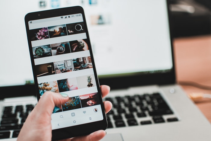
Thumbnail gallery
A design pattern which dates years back on the internet is used by designers of today to portray minimalism. Simple rectangles arranged on a solid backdrop can work well. The format is great and adapts to any screen dimension changes. The number of columns needs to be readjusted each time. A responsive thumbnail gallery can be great.
Featured items
This layout is similar to the gallery, but it focuses more on highlight a limited number of items than a lot of them. Most designers use three of four items to display. You can include the introductory text on top of the columns. It would adapt on mobile screens by jumping into two columns, and then only one in the end. The content also adapts well with it. The navigation will shift from the right to left under the main headline or logo.
Column Flip
The column is one of those complicated patterns but works really well. At the extreme top of the layout, there are elements which define your site and brand. The portion below is divided into three columns. However, as you gradually reduce the size of the browser, the first column will shift on its side and become a row which will be on top of the other two columns. You can add a media query that will shift the elements to the left so that the other two columns remain fixed. The final step is to rearrange everything to be left with one wide column.
Responsive designs are something which leaves your audience impressed with your website. But remember not to add too much on the page so that it doesn’t become a mess.