The 21st century is the era of automation, and thus convenience, brought by the limitless advancements in the tech industry. Consequently, we see an overabundance of smartphones and tablets that ultimately given rise to mobile applications.
Just like mobile apps, we’ve seen a continuous evolution in the interface design of apps. Every year has brought with it a new trend in the UI and UX area. Most of those trends continue to live on to this day while some withered away like old petals.
Let’s see what the current year, 2015, has brought with it and which ones from the past year it continued to foster.
Flat Design with Depth
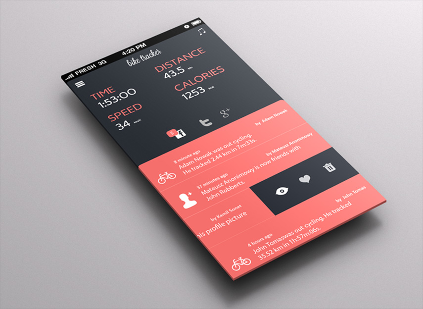
2014 was the year of Flat design, which boasted a minimalist interface with muted tone and flat icons. However in the 2015, we see a rise in dynamic designs that although have a flat-like appearance but also swanked depth and a bit of animation. The trend is popularized by Google and they have named it Material design.
Lively Persona
It isn’t just the appealing icons or vibrant colors that attract the users. What they want to see isn’t just visual appeal but a touch of personality as well. Therefore, designers started to add playful components in the design like bouncing icons, tensile panels, etc. that make the overall interface more enjoyable to interact with.
Light Icons
Though material design is gaining everyone’s votes, you can’t say minimalism is out of the picture yet. We can clearly observe see it in app designs that are using thin, vector icons that are although simple but elegant.
Generous Spacing
Lean user interfaces are those that don’t just offer elegance or appeal, but also clarity. The best way to achieve super clarity across the board is by using extra spacing. Added spaces is great for the overall content (text) as well as it makes the matter more understandable.
Dim or Fuzzy Background
Adding appeal to the design as essential as ensuring its usability. An ideal way to add that appeal in today’s app interface is by adding vivid backgrounds. The background can later be blurred or dimmed when an app is opened.
The trends listed above are just a tip of the iceberg. There are many more trends making waves and garnering recognition across seas. So, do try out these trends when designing your next android app interface and see how much success it will bring.
Image Courtesy of: heracreativeajans.com