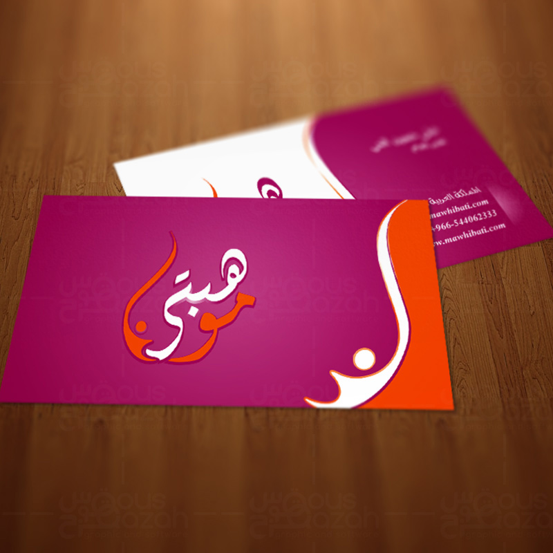
There’s an adage that you may have heard a lot of times, “don’t judge a book by its cover”. Indeed, you never know what interesting bits of content a book may possess until you read it through.
However, our mind doesn’t always work that way. After all, we’re human and we’ve the tendency to judge things or our fellow beings by their appearance. Likewise, in the sacred realm of business, looks matters, and that isn’t limited to shoes, three-piece suit or body gestures, but extends to business cards as well.
Your business card says a lot about your seriousness towards your business. If it reflects an “I-Mean-Business” attitude, consider your business deal done. However, if it reflects otherwise, you can get the picture.
Following are 5 highly-essential design tips to create a business card that your competitors would envy.
Put a Leash on Creative Urges
Creative urges are what fuel the creativity neurons of a designer. However, too much of it and used at the wrong place, can cause undesirable results. The core purpose of a business card is to give the “who-what-where-why” information. Hence, starting off with the design first might result in losing the required space for the key information.
Use Creativity to Save Spaces
Sometimes, there’s just too much information than a business card may include. Here, unchain your creativity to save up spaces while not losing the splendor of the card. One such way you can go about that is by adding a QR Code to your card, as it can include a lot of information without costing any spaces.
Obsession with Borders can be Risky
Some people are obsessed with borders and to the extent that they would ask of it regardless of how much they’ve been warned. Remember that the borders you’d see on the screen may not come as it is when it is printed. Almost all printers are notorious for errors, albeit slight. Hence, the blades often end up cutting uneven on the sides.
Capitalize on the Back of the Card
The enormous white space is the playground of every designer. Luckily, you can find such white spaces on the back of business cards as well. Take your creativity on roll on that playground, and use it for any supplemental branding for more impact.
Get the Basics Straight
Basic information like Trim, Safe Area and Bleeding should be understood clearly before the card is sent to under the printer’s blades. As a designer, you should have a better understanding of these important parameters because if you don’t, you may end up with cards that have some ugly-looking borders.
