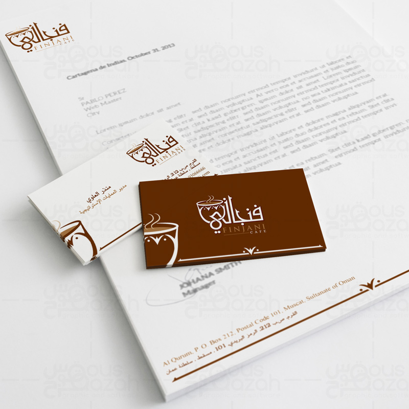
As we’ve entered into the brand-conscious era, we’ve moved pass the point when basic information on a company’s stationeries would suffice. Today, companies have integrated their brand’s essence not only into their marketing collateral but stationery designs as well.
Regardless of how things are going paperless all thanks to the digital media, the need for business stationery can never be ignored. Therefore, it’s all the more important to have a company letterhead that reflects the company’s message, its serious attitude towards its brand.
So, today I’ll be listing a few important pointers that must be taken care of when designing business stationery.
- The Quality of Real Estate (Paper)
The paper that you’ll be using as your company’s letterhead needs to be of high-quality. After all, you’ll either be closing deals through it, or negotiating pricings with your clients. What sort of impression it’d make on the client if the paper appears to be of rough quality? Bad, doesn’t it? So, always use high-quality papers for your company’s stationeries.
- All the Basic Info Plus the Logo and Slogan
Of course, it’s a common sense that you’d mention your company’s basic information on the stationery. What about the logo and slogan? Don’t forget that your logo is the most integral part of branding, which is why it’s a must that the logo should appear across all stationeries of your business. As far as slogan is concerned, some don’t use slogan on all the stationeries but only on the select items. But it is always an excellent idea to add the slogan as well as it adds more firepower to your branding strategy.
- Instigate Emotions with the Right Colors
Ever heard of color theory or color psychology? The summary of that theory is that every color has different meanings attach to it, or you may say different emotions. So, vivid or vibrant colors might make your letterhead stand out in the pile. However, it might end up being a nuisance to the reader’s eye. Therefore, use the color scheme that is light on the reader’s eye and conveys the values in a good way.
- Avoid the Need to Squint with Legible Fonts
Apart from highly-vivid color scheme, another thing that can hurt the vision of the readers is illegible font. Illegibility happens either due to small font size or complex font type, and imprecise font alignment as well. So, make sure that you use simple or standard font type for your company’s stationery and that the same style is kept consistent across other material as well.