A splendid user experience wins you the race in this digitally occupied world. However, achieving such a great success is merely not possible without creating an astonishing user interface (UI).
We use to see a lot of designers and agencies talking about the impacts of a perfect user experience, which is good. But, it is also extremely important to discuss UI and what role colors can play to make it remarkable.
So, keeping in view the significance and power of colors, we thought to share our expert opinion on how you can make the best use of colors to improve user interface of your design.
Let’s get started…
- Understand the Context First
Every project starts with a unique aim, and the color scheme that worked amazingly in your previous projects might not do well here. So, sticking with a stagnant color option is not going to be an intelligent move.
At first, you should understand the context because this is what helps in building the entire interface of your design, and then look for the best possible color options. This way, things will work out for you in a quite convenient manner.
- Feel Free to Experiment
Today, designers have a hell lot of support in terms of color choice. In the form of ready-made pallets of various combinations, looking for appropriate colors of your choice is no more a big deal.
Well, this certainly allows you to come out of your comfort zone, take a deep breath and experiment as much as you can because you have hundreds of tools and software to catch different harmonic combinations.
- Grab Attention with Contrast
Colors simply make or break any design. Therefore, when searching for a relevant color pair, go for contrasting effects. To explain this point in a better way, a contrast of black and white is the most suitable example. While utilizing these two colors, you can easily come up with a lot of contrasts which even improve readability of text on a page.
- Color Combinations with Clarity
No matter what sort of color combinations you are picking up for your design’s interface, they should accentuate clarity as this little yet integral factor enhances usability and provides ample of space to each color, so that it can perform outstandingly for visualizing a striking interface.
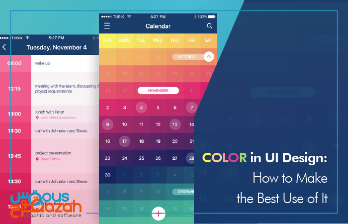
Feature image courtesy of: https://dribbble.com/Tubik