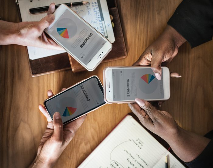
Millennials have seen the evolution of smartphones which kept getting bigger and better. If you look at the original iPhone, you would found it to be too small for your liking. As the trend of bigger phones paved their way, it was an opportunity for website and app designers to improve their design skills.
Here are some of the ways through which you can make your design fit the new 6.5 inches iPhone XS and the Samsung Galaxy S10 which has a huge display of 6.7 inches.
Make it engaging
If someone opens your website, they should know about its content in less than ten seconds. Yes, that’s how fast they would scan your website, so think accordingly while designing it.
Prioritize content. Keep the important stuff at the top, such as your heading (make sure to keep the font large), an attractive picture (it helps to draw their attention) and a few lines about the product or service (make sure to keep it short and snappy, no long boring paragraphs).
At the end of the page, include a form or call to action option to engage the user. Don’t ask them for too many details; just their name and email would be fine.
Keep the navigation simple
‘Less is more’ is the key here. When thinking about navigation, don’t include too many options. Instead, keep only the basic ones.
The hamburger menu which was popular among the small screen phones has lost its charm and is not compatible with the larger phones’ design. They just look tacky and won’t interest the user.
With larger screens, you have greater control to design accordingly. You can include larger button-style elements at the lower portion of the browser or app, for example, the Calm app. They have placed a row of anchored elements at the bottom of the screen.
Consider different thumb sizes
Not everyone uses their phone with one hand. Some use two hands to hold the phone, especially the larger ones, and use multiple fingers (not just the thumb).
You need to keep in mind that the design should facilitate all types of users, and they should feel ease while browsing your website or using your app. Remember that most of the activity happens at the center of the screen, so that is where most of the options should be.
You can always test your design on different apps and see whether it is feasible to use or not. Purchase a new model phone and test your design on it.
I hope these tips were useful in designing for your website, or app which would fit on large size phones.
