Like the selection of your logo or the color scheme on your website, typography also plays an integral role in making the right impact on the readers. A bad typography would fend off the readers from going any further, while a great typography can hook them right from the header of your web page or brochure for that matter.
Typography isn’t something that you can simply use on any material without giving any thoughts to its key mechanics. To tell you the truth, there’s a lot behind the working of a good typography than meets the eye.
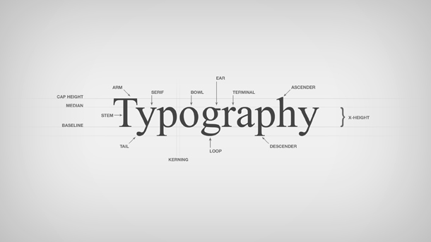
Here’s a pocket-guide on what you should and shouldn’t do when playing with the typography.
- Don’t Use Genetically Incompatible Fonts
Genetics play an important role in the compatibility of fonts as well. You can’t couple up whatever fonts you like. Every font has a different role- some are meant to be used as headers/titles, while some are created solely for body text.
- Don’t Go In the Shadows
Indeed, shadows do accentuate the splendor of a text. However, it’s not written in stones that you must always use gray or dark shadows. First of all, avoid adding shadows to begin with. However, if your urge for shadows wins over your need, then be creative and use different hued shadows.
- Don’t Lose Your Control Over New Fonts
Professional designers around the globe agree that a designer shouldn’t go overboard with the use of different types of fonts in a same artwork. They also agree that one should be using a maximum of 3 genetically compatible fonts.
- Don’t Go Justifying Everything
The thought of aligning the text may seem pretty neat. However, when you practically apply it, you are left with a lot of white spaces that shatter the splendor of the text. So, justify the text only when there’s an important need. Otherwise, leave it as it is.
- Do Apply the Right Contrast
Contrasting the color of the fonts and the background on which they will be positioned can get quite difficult at times. Unless you’ve a good sense of the use of colors, you might end up ruining your work. Therefore, make sure that the font color fits perfectly well with the background.
- Do a Manual Job on Kerning
Kerning in the text makes all the difference in making or breaking the effectiveness of the text. Most of the times, it should be left as it is. However, if the need is a must, then it should be done manually, and not left to photoshop or any other tool.
- Do Give Due Attention to Hierarchy
Hierarchy in the selection of typeface controls the flow of the content. It basically tells the readers what the texts relate to each other.