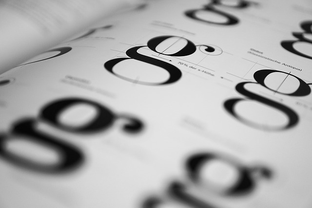
Apart from arranging and blending fonts appropriately with a particular theme, typography is much more than that. It is more like a breath to any design which drastically enhances the feel and provides more reasons to a reader to take notice.
Whether you are an aspiring designer or have accomplished a lot in this field, mistakes can happen. You can be the victim of a bad typography usage, but keeping a couple of significant factors in mind, you can bring in a subtle perfection to your work.
And, this is what we are going to discuss here.
Typography mistakes that can ruin all your efforts!
So, read on, and make sure to avoid these silly mistakes to eradicate a big flaw from your work.
- Overcrowding Letters and Lines
The issue is quite common and negatively impacts the readability of your text. We, in order to fit in a lot of text in a shorter space, try to commit such mistakes, but get paid off eventually.
There is a very simple yet legitimate point that when letters are too congested and the spacing between lines is too pathetic, the overall structure loses its significance. Therefore, it is important for you to avoid this aspect to make your text look clean and not clutter.
- Miscalculating the Readability Factor
When you talk about attraction in design, readability should be given extreme priority. There are dozens of factors that you need to take care of. From color combination to a convincing use of fonts and typography, every implementation matters and enhances the legibility of your design.
- Still Relying on Double Word Space Game
Gone are the days when this habit was considered to be an acceptable style of presenting something. Now, it is gone. And, you need to understand that too.
- Being Reckless About Orphans and Widows
The body of your copy can accentuate a very bad feel, if it doesn’t care about orphans and widows equally. Both of these terms are sometimes used interchangeably, but they are typographical lingo that come at the bottom or top of your page.
From a reader’s perspective, it obviously is something that can be a prominent distraction, and being a designer, the only choice you have is to eliminate it completely.