
Logos are the “speak-for-itself” identity that even at a single glance can relate to which brand it belongs to.
Some logos are churned out without given even an ounce of thought to its relation to the brand or its message. However, there are some – mostly the famous ones – that carry the brand’s message within. Often those messages are as lucidly illustrated as a sky, while sometimes they are so ingeniously camouflaged that you’d have to look twice or even thrice to see it.
Has that sparked your curiosity? Figured that!
Here are 5 logos of world’s most renowned brands and the cryptic messages that they carry.
Le Tour De France
Image Courtesy of: Letour.com
Fan of bicycling? Then you’d definitely be familiar with this popular event. But have you ever looked at it up close and tried to find any hidden message in it? The logo of Le Tour De France is perhaps the most creative work of art ever. The double “O” of the logo illustrates the wheels of a bicycle, while “R” represents a cyclist.
Continental
Image Courtesy of: Continentaltire.com
Who isn’t familiar with Continental, unless one doesn’t own a car? Continental sits at the forefront of tire industry all over the globe. Clearly, its products aren’t the only thing that reflects the excellence the company provides. Just look at the “C” and “O” in the logo of the company, and you will see how brilliantly the two elements depict the core product, a tire.
Northwest Airlines
![]() Northwest Airlines rivals big airline giants like Virgin Airlines. Upon seeing the logo, notice the small red triangle in the circle. Now, assume the circle as a compass, and guess where that triangle points? To Northwest!
Northwest Airlines rivals big airline giants like Virgin Airlines. Upon seeing the logo, notice the small red triangle in the circle. Now, assume the circle as a compass, and guess where that triangle points? To Northwest!
Formula One/F1
Image Courtesy of: formula1.com
Small cars with wide tires, ring any bell? Formula One is amongst the most watched cars’ sport all over the world. The sport has clearly applied its brand’s message in the logo as well. Focus on the white space between the F and red markings. It represents the “1” in the Formula one or F1 and the red lines represent the tracks.
Beats Headphone
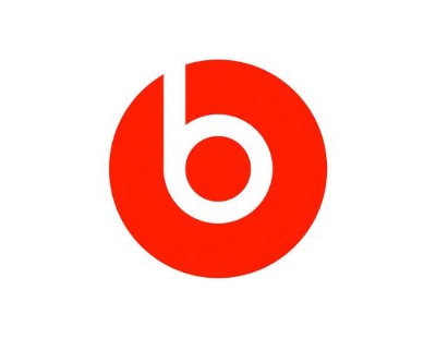
Image Courtesy of: beatsbydre.com
Beats headphone provide the best, electrifying sound quality you’d ever experience. The brand is so insistent that people should give it a try that they even put their headphone on their logo. Notice the small “b” in the logo. It is positioned in a way as if a person is wearing a headphone.