Ramadan is a month that teaches the true meaning of sacrifices, love and peace. It’s the Holy month that brings us closer to Almighty Allah by performing five times prayer, reciting Holy Quran and doing charity. Continue Reading →
Page 1

Standard
Proven Ways to Make Your Website More Interactive and Engaging
Creating a website in this tech-era is no more a daunting task, but making that website customer-centric and successful definitely is.
Whether you are running your personal website to earn pocket money through ads and various affiliate programs or your business solely relies on it, you really have to make it interactive.
Readers always want to spend time on websites that have so many things to offer. Therefore, it’s your responsibility to fulfill all the requirements of your audience through a compelling website. And to be honest, it’s pretty simple. Continue Reading →
Standard
Photoshop vs. Illustrator
Adobe is the ingenious company behind a plethora of multimedia products and creative software available in the market today. Adobe’s programs have enhanced the performance of many individuals with its range of products that fit a diverse market with a distinct set of needs.
However, such a variety does come with its own confusions as to which products to use and when. Here we will discuss its two popular software programs, Photoshop and Illustrator, to help you make the right choice. Continue Reading →
Standard
3 Tips to a Responsive Logo Design
When talking about responsive web design and the practices related to it, Logo is one part of the design that often gets overlooked. In most of the responsive galleries, logo gets shrunk in the space that is available, instead of finding a solution that finds properly reducing its size and finding relevant space for it. Continue Reading →

Standard
The Difference between Calligraphy, Lettering and Type
Many a times people mix up the terms calligraphy, lettering, and type, thinking them to be interchangeable. They are often thought to be three different ways of saying the same thing. However, these differences between the three are huge and also very important to know, if you plan to have a serious career in either. This article will highlight the differences between the three. Continue Reading →
Standard
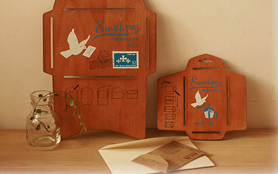
6 Creative Envelop Designs for Inspiration
If you like to design your invitations yourself or write a letter to someone special to you, you should consider designing your own envelopes. Designing your own envelop is fun, easy, and gives a personal touch to your invitations and letters.Following are some creative ideas for attractive envelop designs. Continue Reading →
Standard
Understanding the Golden Ratio in Design
It is said that a divine proportion can be found in nature and other things around us. This proportion can be seen at work in countless things including our bodies, beehives, flowers, etc. Every designer must also know about the Golden Ratio and its use. Continue Reading →
Standard
An Interesting Correlation between the Two Distinct Components (Typography & User Experience) of an Ideal Design
You get a new project on your desk. You start with the framework of the design. Next, you get the logo designed as well as the website layout. You then move on to some specific components of the design like color scheme, navigation bar, a beautiful header or slider, etc. Once done, you move to the “Live” phase. That’s all you do in designing a typical website, right?
It is apparently quite common in the design industry that some designers tend to overlook the impact of User Experience (UX) on their website. The website they design although appears appealing, yet they see a huge decline or lack of visitors on it. This all happens when the UX of the website is bad, and one of the many things that lead to a bad UX is inappropriate typography. Continue Reading →
Standard
5 Design Tips for an Aesthetically-Professional Business Card
There’s an adage that you may have heard a lot of times, “don’t judge a book by its cover”. Indeed, you never know what interesting bits of content a book may possess until you read it through.
However, our mind doesn’t always work that way. After all, we’re human and we’ve the tendency to judge things or our fellow beings by their appearance. Likewise, in the sacred realm of business, looks matters, and that isn’t limited to shoes, three-piece suit or body gestures, but extends to business cards as well. Continue Reading →